
It’s time for another blog series and this posts will be centered around how to customize and brand the global navigation in SharePoint 2013 online or on prem. In November 2010, I published three post in this subject for SharePoint 2010, and so far this posts together have generated 165.000 views and 166 comments. These blog entries has become a great success, and I am of course happy to be in any help when you are about to modify the navigation.
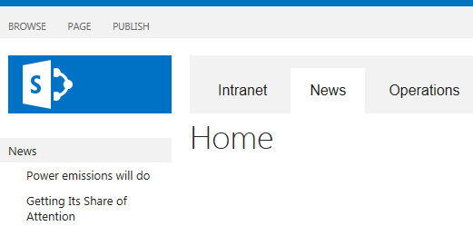
Creating a nice looking global navigation is a great way to improve the look and feel of the SharePoint site. A design that is well built and attractive will increase the usability and simply make the users happy! This post is based on a structural navigation in SharePoint 2013 server, and the focus is on the CSS parts. Let’s start with an easy example of how you can add some styling for the global navigation in order to get tabs in the navigation like the image below.
Three years have elapsed since the last time, so what has happened since SharePoint 2010 in terms of the global navigation?
- The rendering markup from the navigation controls with class names has changed slightly
- SharePoint 2013 is by default CSS3 and HTML 5 friendly
- New jQuery framework and jQuery plugins to be used
- Managed navigation that allows us to define the navigation based by Manage metadata
The OOTB markup for the global navigation looks like this:

It’s still a complex markup and a lot of classes to deal with but let’s start with an easy example just to get going. I have added comments to the classes so you should be able to change for example colors and paddings by your needs. I’ll publish more examples in the next post.
/* --- Global navigation --- */
#DeltaPlaceHolderMain{
margin-top:30px;
}
.ms-breadcrumb-top{
background-color:#f2f2f2;
}
.ms-core-navigation > div > ul.root > li.static a:link, ul.root > li.static a:visited{
font-family:Arial; font-size:16px
}
/* links */
.ms-core-navigation > div > ul.root{
padding-top:8px;
padding-left:8px
}
.ms-core-navigation > div > ul.root > li a{
border:1px #fff solid;
padding:15px 20px 22px 20px;
font-size:15px;
}
.ms-core-navigation .ms-core-listMenu-horizontalBox li.static >  .ms-core-listMenu-item{
margin-right:8px
}
/* links not selected */
.ms-core-navigation > div > ul.root > li.static a:link, ul.root > li.static a:visited{
color:#222
}
/* links selected */
.ms-core-navigation > div > ul.root > li.static > ul.static > li.selected a:link, ul.root > li.static > ul.static > li.selected a:visited{
color:#222;
background-color:#fff
}
/* home link selected */
.ms-core-navigation div.ms-core-listMenu-horizontalBox > ul.static > li.selected a.selected{
border:1px transparent solid;
background-color:#fff
}
/* home */
.ms-core-navigation > div > ul.root > li.static > ul.static{
margin-left:0px
}
/* Hover */
.ms-breadcrumb-top .ms-core-navigation ul.static > li a:hover{
border:1px transparent solid;color:#222;
background-color:#fff
}
The next post in this series will cover
- More branding examples you can download and use in your SharePoint environment
- Using a ASP repeater control with jQuery to render custom markup
- How to use jQuery for various UI effects
- Branding example for a managed navigation
Please drop a comment if you have any question or just ideas for the next posts!
/ Christian
 Me & My SharePoint [FrontEnd]
Can you tell how we can add the susite in global navigation like in your post Internet News Operation reply as soon as possible
Hi Deepak, yea I’ll include something about how to display sub sites or pages in the global navigation and how to apply styles in the next post (part II), tnx – stay in tune!
Reblogged this on Sutoprise Avenue, A SutoCom Source.
eagerly awaiting part two!
Hi Stahl,
this is pure aspx code, I need to have it in HTML for master page, can you put the HTML version? this is very important for me.
Thanks
Hi Christian, thank so much for your precious work about SharePoint Branding. Do you have an estimate when your next post (part II) is going to be published?
Sorry Christian, i’ve found part two now 😉
Hi Christian,
Do you have a step by step on how to apply this CSS ?
Thanks,
Alan
I am currently try to apply some custom styles to the structural navigation aka ms-core-listMenu-verticalBox on my custom layout page – the links on my branded team site are generated with a snippet. Looking with Firebug there are potentially lot of classes to override “static menu-item ms-core-listMenu-item ms-displayInline ms-navedit-linknode. Do you have any tips on which of the classes I should start override if this is the way to go.
Hi Christian, I am honestly confused on how to add the CSS file to the master page gallery so it will override the default SharePoint style for global navigation. Sorry, I am a noob at SharePoint and your blogs seem to be the best I have found. However, I am at loss on where to put the CSS file and how to get the changes implemented.
Hi Tyler! You have several options to add your own CSS into SharePoint. One way is to Create a CSS reference into a custom master page (if you already have a custom one.. go for that), Another way is to inject CSS is by ‘alternative CSS’. There are more options as well and what suites you best is depending of the SharePoint version and the architeture etc. If you wanna discuss that, I would my self put up a question in MSDN forums for SharePoint. Good luck!
What CSS do you need to add to get the dropdown navigation to pickup the above styles? I have added what I thought would work but it seems to only keep the CSS on the top level.
/* — Global navigation — */
#DeltaPlaceHolderMain{
margin-top:20px;
border-radius: 8px;
}
.ms-breadcrumb-top{
background-color:#f2f2f2;
border-radius: 8px;
}
.ms-core-navigation > div > ul.root > li.static a:link, ul.root > li.static a:visited{
font-family:Calibri;
font-size:15px
}
/* links */
.ms-core-navigation > div > ul.root{
padding-top:8px;
padding-left:8px;
border:1px #fff solid;
background-color:#f2f2f2;
font-size:15px;
border-radius: 5px
}
.ms-core-navigation > div > ul.root > li a{
border:1px #fff solid;
background-color:#f2f2f2;
padding:10px 15px 10px 15px;
font-size:15px;
border-radius: 5px
}
.ms-core-navigation > div > ul.root > li > li a{
border:1px #fff solid;
background-color:#f2f2f2;
padding:10px 15px 10px 15px;
font-size:15px;
border-radius: 5px
}
.ms-core-navigation .ms-core-listMenu-horizontalBox li.static > .ms-core-listMenu-item{
margin-right:8px;
}
I am working in SP 2013. My Top Navigation Bar has flyout menu displaying the subsite. As I navigate to the sub-site and then hover over its Top Navigation Bar, I can see its flyout menu displaying its sub-sites. I can do this and navigate several level down but I reach a level where the flyout menu that displays is so narrower that it wraps one word at a time and is difficult to read. I am looking for help on how I might control the width on the flyout menu. Any help would be appreciated.
Hi Catherine! I’m not really sure that I understand exactly what you need to do with the navigation but I’ll try to help you. Easiest way would be to setup this structure of navigation and sub sites in my testenvironment, and just test it out. Well let me know if this is super important for you, if so, I’ll mail you about how to solve this instead.
I don’t know how to explain it without adding a image and it will not allow me to do this. Let me try again.
This is what is happening: I have a structure with multiple layers of subordinate sites. Let’s say 5 levels of sub-sites. At the Home Page, the Top Navigation Bar has flyout menus that open in a cascading manner and from the Home Page, you can use the flyouts and skip all the way to the lowest sub-site. For example, by staying on the Home Page and just hovering over the flyout menu, (don’t click on any links) just hover over a link in the flyout, the next flyout displays, hover over the desired link and the next flyout displays and so on. In other words, by just hovering over each flyout menu, you end up with a cascading display of the flyout menus and clicks to navigate to the 5th level sub-site in one step. All the links in these flyout menus (accessed from the Home Page) are nice, wide, and legible, displaying one link per line on the flyout menu. The problem is, When I hover over the flyout menu at the 4th level sub-site or the 5th level, they are opening and displaying so narrow that my end-users are complaining they are difficult to decipher.
What my question is about:
If I navigate into the subsites one level at a time, click that sub-sites top Nav Bar, (do not use the flyout menu) and just navigate one site at a time using the main link on the Top Nav Bar, by the time I get to the 4th level, when I hover over the flyout menu way down in the sub-site, the flyout menu displays so narrow that the name of the link is not on one line anymore. For example, if the name of the link is three words, it is wrapping around and putting one word per line. So it looks like three links (until you hover over it! lol)
I was hoping there was some CSS that controls the width of the flyout menu so I can manage the flyout menu at these lower level sub-sites.
If you have any other questions, please let me know and I will try to find a better way to explain. Also, if you do not hear back from me for a while, please know I am getting ready to be off for the holidays until next year and will get back to you when i return.
Thanks for your help with this!
Kindest Regards,
Catherine