
Branding, SharePoint Online, SPFx, Web Part
Branding, SharePoint Online, SPFx, Web Part

Branding, Extension, SharePoint Online, SPFx

Branding, CSS, o365, SharePoint Online, SPFx, Web Parts
o365, Public Speaking, SharePoint Community, SPFx


Public Speaking, SharePoint Community

Branding, SharePoint Online, Web Parts

Branding, Modern theme, PowerShell, SharePoint Online, Theme

Public Speaking, SharePoint Community
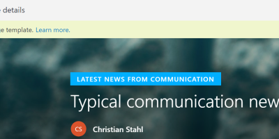
Page template, SharePoint Online

Public Speaking, SharePoint Community
o365, Public Speaking, SharePoint Community, SPFx

 Me & My SharePoint [FrontEnd]